Responses by Sam Stuchbury, executive creative director and founder, Motion Sickness.
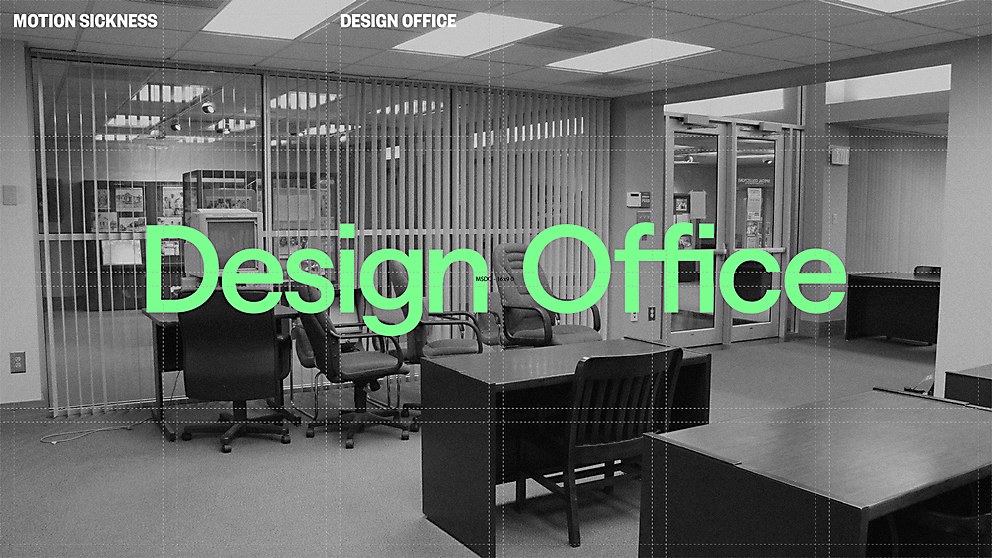
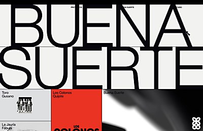
Background: This site was designed to be the digital home of Design Office, our new agency arm at Motion Sickness. Beautiful design and top-shelf craft have always been at the core of our work, so the agency was already delivering branding and identity projects for many of our existing clients. Formalizing that into a proper offering felt like a natural evolution. We wanted to give design the love and attention it deserves within advertising.
Having the culture of disruptive creativity born within the agency now present in a design firm felt pretty interesting, too. A modern marriage of brush and pen, art and commerce. An advertising agency and a design agency living in the same house, but sleeping in separate beds—a marriage of unique combined strengths, while retaining the emotional space to be one’s own self.
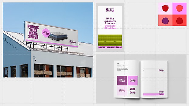
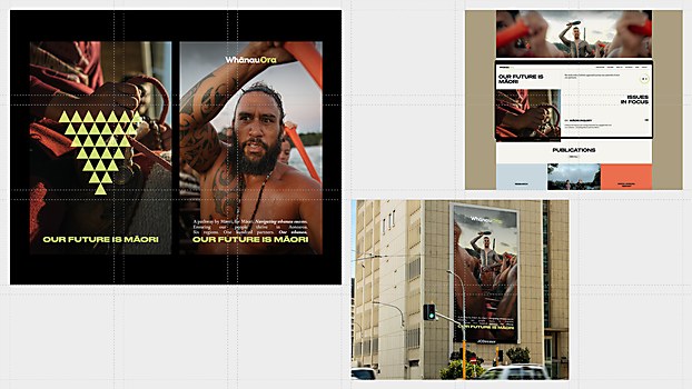
Favorite details: It always comes back to the work, so having a format to show off our design projects beautifully feels pretty good: a fragrance brand that smells like a street to a publication for drunk chefs. The range in the work within the site is something we are all proud of. The Design Office will tackle all thinking regarding branding and identity—everything from large-scale rebrands to designing a publication. Within the Office, we focus on the art of design rather than the art of advertising.
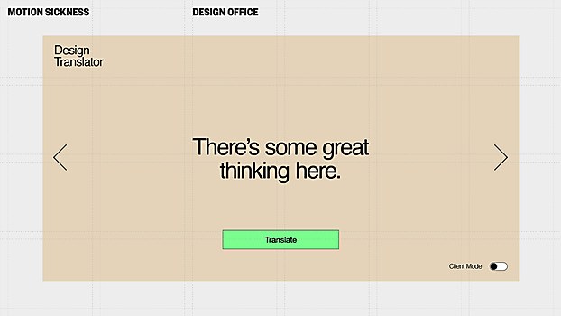
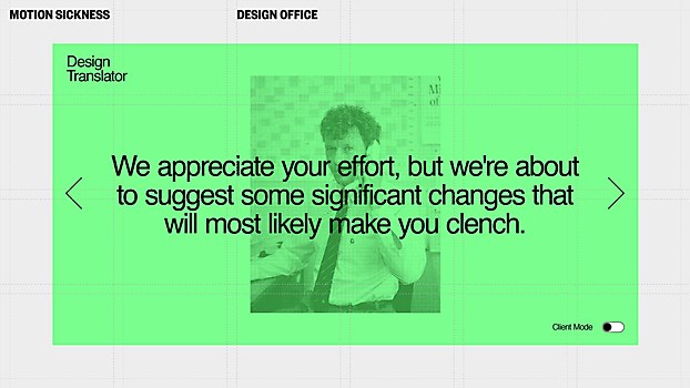
Larger picture: The site was the core base for our launch, but more specifically, the Design Translator has formed the hook of our campaign. Designers and clients don’t always speak the same language; our translator ensures optimal synergy between creatives and corporations. At Motion Sickness, we don’t take ourself too seriously but like to be self-aware. We love what we do, but we don’t lose the perspective that sometimes the corporate work of advertising and design can be at odds; much of it awash with delightful irony and comedic tension.
The Design Translator stemmed from an awareness that client-to-designer and designer-to-client communications can therefore sometimes break down. For example, the passive-aggressive, wordy emails often landing on the desks of each partner of the engagement could sometimes benefit from being more direct. Also, we just thought it would be funny to mine such talking at cross-purposes and decode it.
Challenges: Probably writing for the design translator. Many of the translations emerged from the weird world of email threads you sometimes find yourself entangled in mid-project. The whole team chipped in with examples; we also asked friends within the creative industry for some of their most relatable design language barriers.
New lessons: Branding yourself as an agency is really hard. You are your own worst client. However, we went on a journey and landed in a palace we couldn’t be happier with—it just took some time and a few rounds of client notes.


