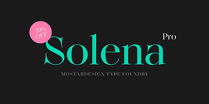
Responses by Olivier Gourvat, type designer, Mostardesign.
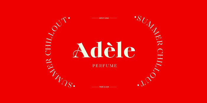
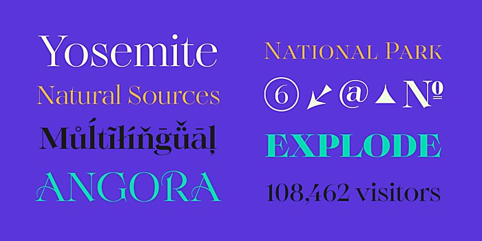
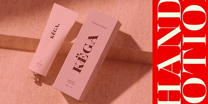
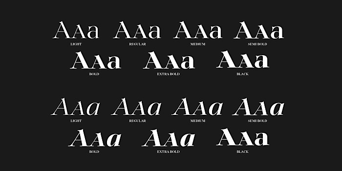
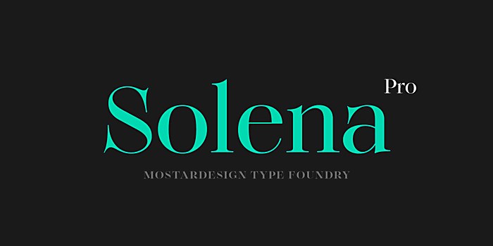
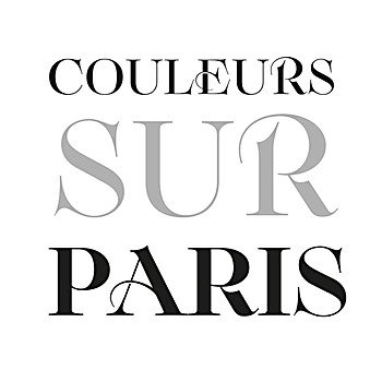
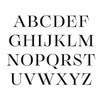
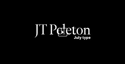
Background: My goal was to design a new serif font family that combines sophistication, elegance, and refinement while maintaining a timeless touch. This approach aimed to meet the aesthetic expectations of prestigious sectors such as luxury, cosmetics and perfumery. These industries require meticulously crafted typography to showcase their products in a striking and elaborate manner.
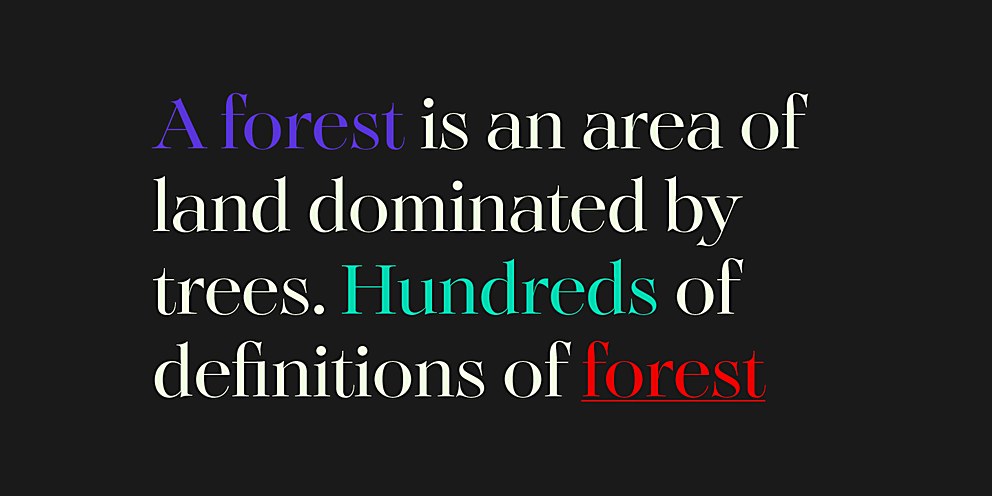
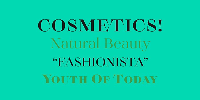
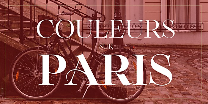
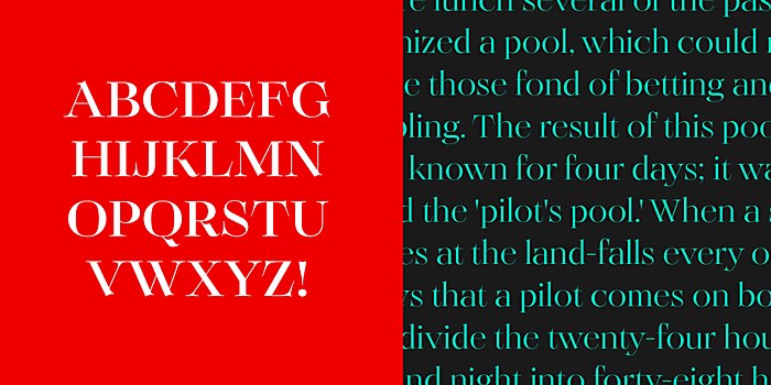
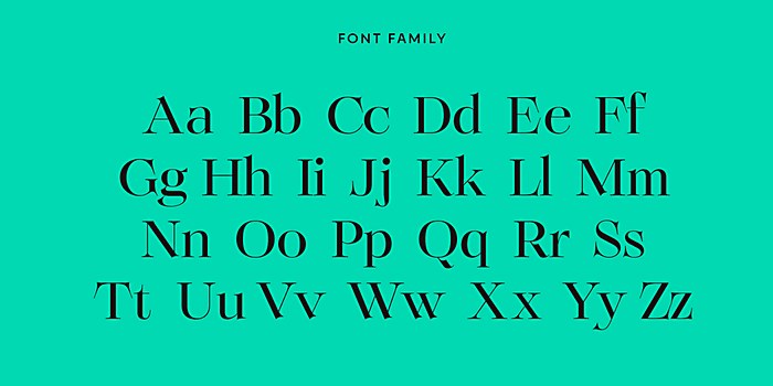
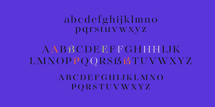
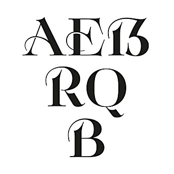
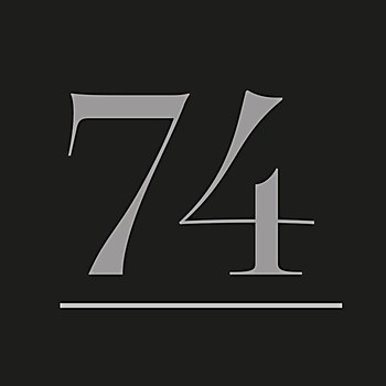
Design thinking: Inspired by some very old specimens from the 18th and 19th centuries that I own, I began designing the characters by incorporating wide and slender serifs accompanied by voluptuous curves. The characters were intended to feature exceptionally generous widths, especially for uppercase letters like E and S, as well as particularly extended descenders, such as that of the uppercase T. In pursuit of modernity, I also harmonized the widths of the characters for enhanced readability.
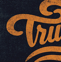
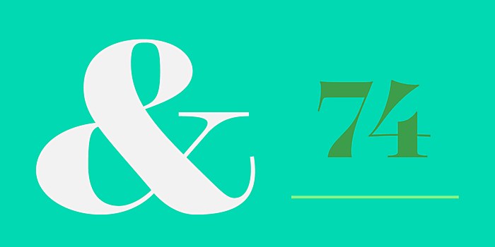
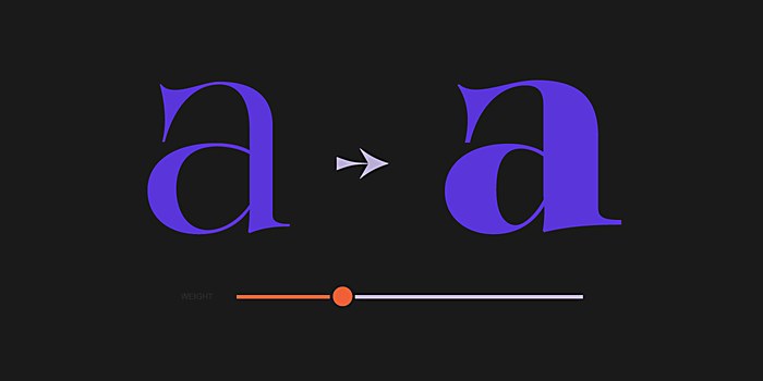
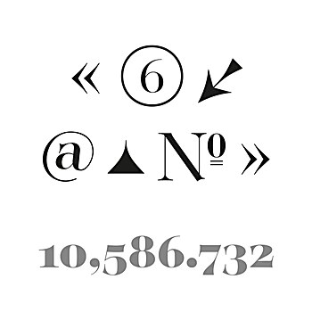
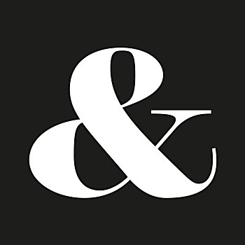
The primary goal was to create a typeface that meets the visual standards of communication and branding professionals in the luxury sector. To achieve this, I deliberately designed characters with bold and imposing strokes, adorned with apexes and vertices that extend well beyond the letters with pronounced protrusions—thereby imparting a touch of originality and elegance to the typography. Throughout the process, I aimed to achieve a final appearance that is both elegant and refined for this alphabet, ensuring that every detail contributes to this sought-after aesthetic.
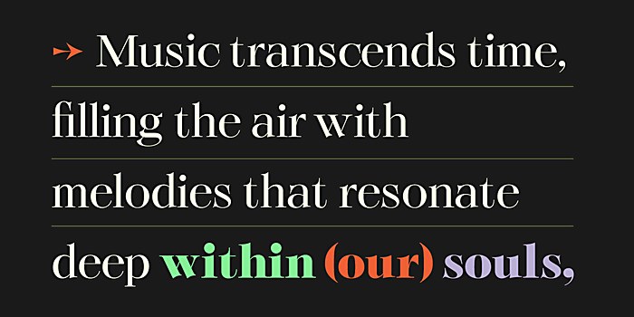
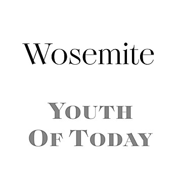
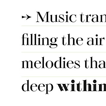
Challenges: Achieving a lavish appearance while preserving optimal legibility. I wanted to exaggerate forms and letter apertures while ensuring the characters remained easily readable, particularly when used in lengthy paragraphs.
Favorite details: Having reached the end of this project! Creating typography of this kind is extremely time-consuming, and achieving a result—whether good or bad—is already a success in itself. I am rather pleased with the final outcome, especially regarding the overall appearance of the alphabet. This goal was paramount to me in this creation. Each character has been meticulously crafted to ensure aesthetic consistency and meet the demands of professional designers seeking a balance between originality, expressive character and overall readability.
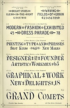
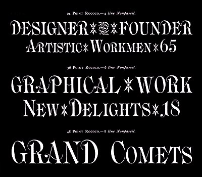
Visual influences: Before starting on this new typeface, I sought inspiration from old specimens from the 18th and 19th centuries, particularly those from the prestigious Boston Type Foundry, renowned for its prolific production of original serif typefaces. While exploring various specimens from this foundry, I came across the Rococo alphabet designed by Charles E. Meyer in 1884. Despite the passage of time, this typeface still appeared remarkably relevant. The opulent, expressive style of the characters immediately caught my attention, offering an aesthetic that is extravagant, refined and perfectly suited to the demands of contemporary designers in branding and editorial design.
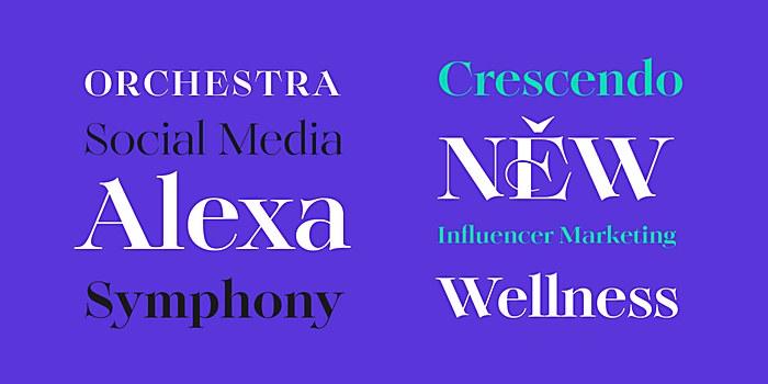
Alternate paths: Character design allows for almost indefinite revisions to improve elements that may not please in certain letters. This is rather fortunate because I don't always get everything right on the first try when creating a new alphabet! Instead of starting over entirely, it’s possible to rework certain aspects. With this type of serif characters, there are always numerous details that can enhance the overall appearance of the typeface. What may be lacking is the time needed to refine all these little things. In this vein, I could add other stylistic variants to enhance the graphical originality of the characters when using the typeface in headline creation.


