Responses by Michael Parson, typeface designer, Typogama.
Background: This project was launched as a result of my curiosity about the history of printing. As a lifelong fan of typography’s history, I realized that I knew very little about the origins of print in my own hometown of Geneva and set about researching the topic.
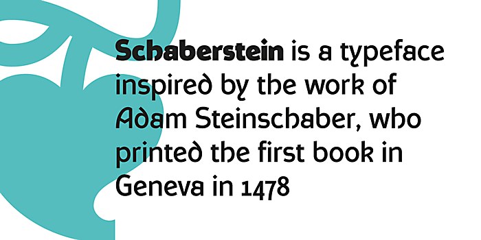
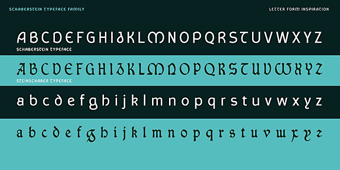
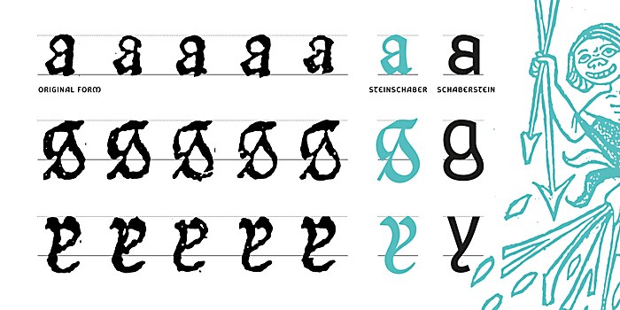
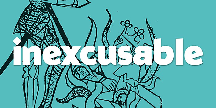
As we have seen in many fields and communities, contemporary researchers also question why certain names and places are mentioned while others seem forgotten to time, and this also rung true to me in typography. I came across a marvelous publication printed by Genevan printer Adam Steinschaber in 1478, which is recognized as being the first printed publication in the city. I was particularly struck by a few unique letters, notably the reversed capital S and the lowercase y with its tail that bent round to the right, characteristics I had not seen in any other typeface of that time or since. This curiosity drove me to undergo this project with the goal of celebrating and reviving the work of this forgotten Genevan printer.
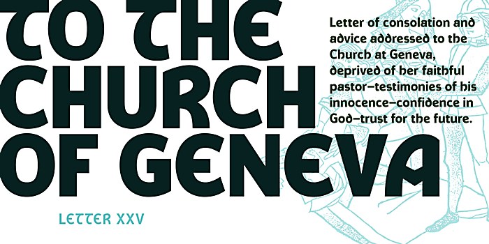
Design thinking: I had initially classified my research as pure academic interest, but as time wore on, I kept thinking back to these particular letters and decided that I wanted to use my knowledge of type design to attempt a revival of Steinschaber’s work, thereby giving his achievement a fresh recognition and audience. The first impulse behind the project was therefore driven by a historical curiosity of wanting to celebrate and revive his work, but also introduce his unique characters to a wider audience. As a rotunda-styled gothic typeface, Steinschaber could be employed in a historical context for museums or other cultural applications, but it is also suited as a display typeface in a wider range of settings—were there was a desire to have a unique, striking identity.
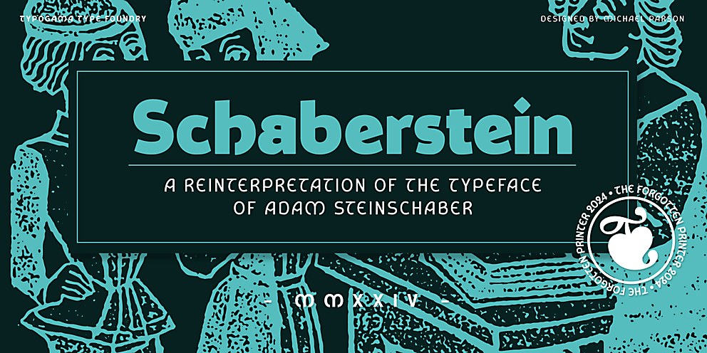
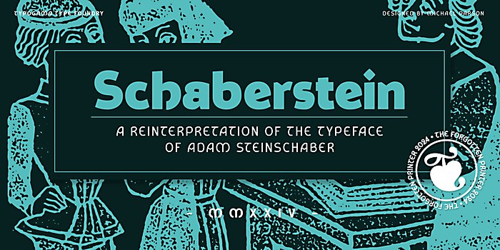
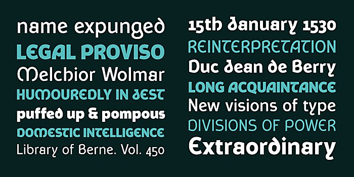
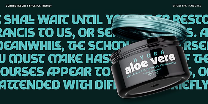
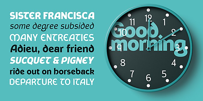
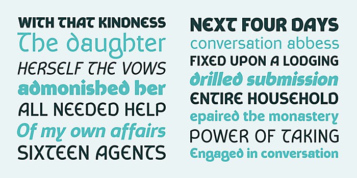
While my work on the Steinschaber typeface had been about aiming for a certain historical accuracy, with the Schaberstein family, I felt much more liberated in my creative process. Using the historical letters as a wireframe, I wanted to bring the spirit of Steinschaber’s typeface into our contemporary age by adapting the form for the modern requirements of a digital typeface. The original font adopted a rotunda gothic form that was in vogue in Italy at the time, one which Steinschaber and others would then spread throughout Europe with the printing trade. By that same logic, the style of our time drove me towards the sans serif form, stripping down the ornamental aspect to solely focus on the letter shape.
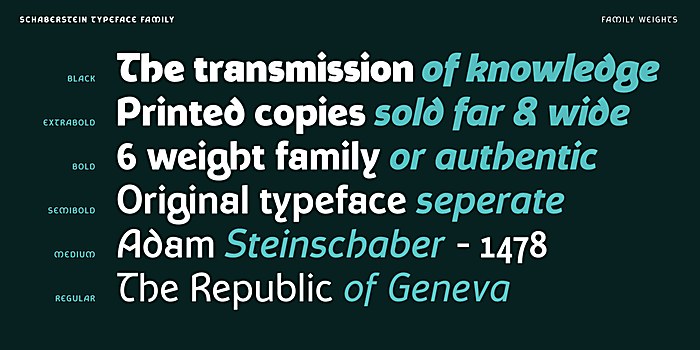
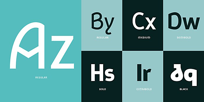
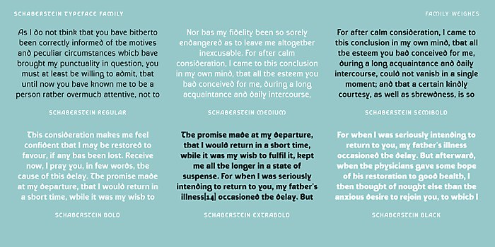
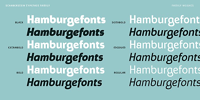
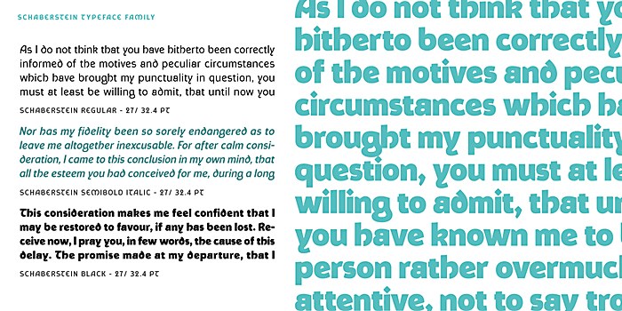
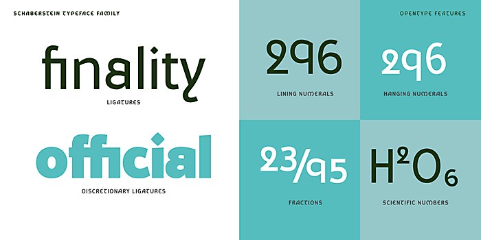
It was also important to me that the family covered a range of weights, enabling more variety when setting text. The weights range from a regular to a very dark black weight. It was also important that this typeface embraced the advances that digital fonts have seen over the past years by including a range of Opentype features and offering the typeface as a variable font. I did wonder how the pioneering printers would view our modern tools and whether they would be as amazed by our craft as we are by theirs.
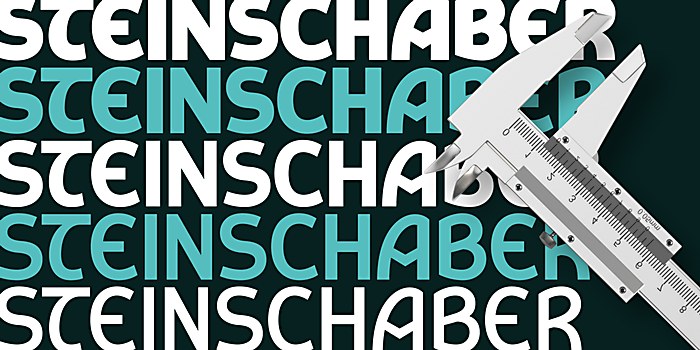
I had some debates about the naming of the typefaces and had initially thought of keeping both typefaces under a same name to maintain their link. But as time progressed, I noted how both designs had been created in a different spirit. They shared a common history but seemed to speak to different audiences. I settled on a compromise: Steinschaber would be named after the original printer, celebrating and recognizing his particular work. The second modern typeface used a little word play by inverting the two german words—Stein meaning “stone” and Schaber meaning “scraper”—becoming Schaberstein.
Challenges: Both typefaces presented different challenges for different reasons. While I was working on Steinschaber, I wanted to create letters that would be close to the original font Steinschaber had employed. This led to a lot of different approaches to its construction, trying my best to grasp what type of shapes he would have employed—since I was only viewing a printed specimen and not his actual lead letters. I decided that I would create a revival that allowed a certain amount of interpretation and freedom in the forms while aiming to maintain a similar texture when the letters were set in a line of text. This freedom meant that I chose what I considered to be the best and most functional solutions—for example, reverting to a capital S that was in the correct orientation. Thankfully with Opentype features, I could then add in more decorative and authentic capitals as the titling feature, so users can decide whether to set the text in the more legible, familiar manner or in a more authentic style with the feature activated.
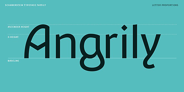
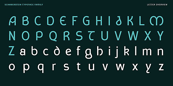
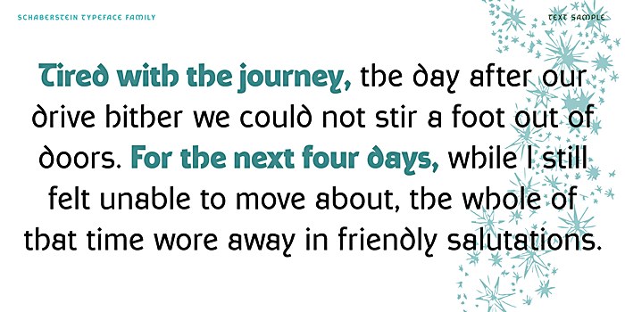
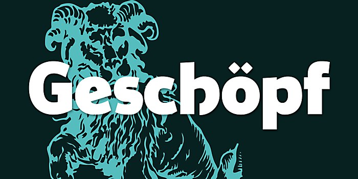
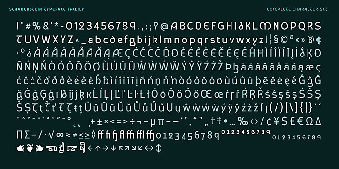
When I started the work on the Schaberstein family, the creative process was more liberating as I had free rein over the general style and interpretation of the forms. The first question was linked to the overall style of the typeface, but the greater questions arose from how I could infuse this new family with the spirit of the original font. It was important for this phase to create a more versatile design that could be employed without any link to the source but still contained some of the unique and charming aspects of his glyphs. The task focused on blending the two worlds. This is visible in letters like the capital A with its angular crossbar or the curved E and M, but also in the lowercase forms with the closed double-storied a, the curved g and the y with the tail that bends to the right. The challenge was therefore to integrate these particularities while maintaining a consistent rhythm and balance over the whole alphabet.
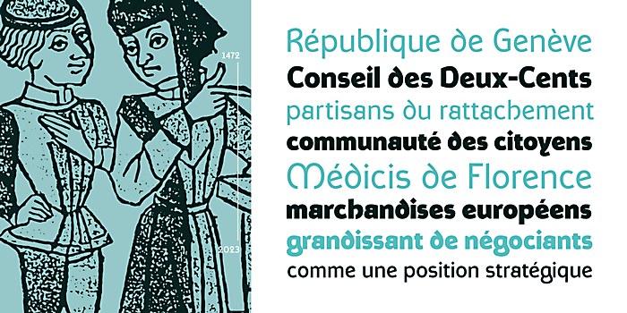
It was also important that the Schaberstein had multiple weights to enable more variety while setting text. I decided, from the outset, to avoid the light weights, as one target was to create an editorial typeface and those finer weights function less well in small sizes. However, I did want to expand the design into a very dark black weight that presented a few challenges on how best to balance the stroke weights.
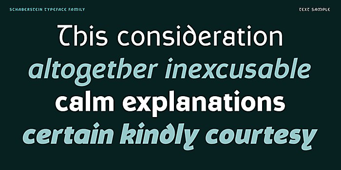
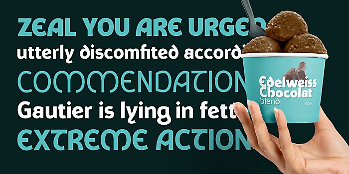
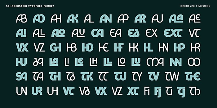
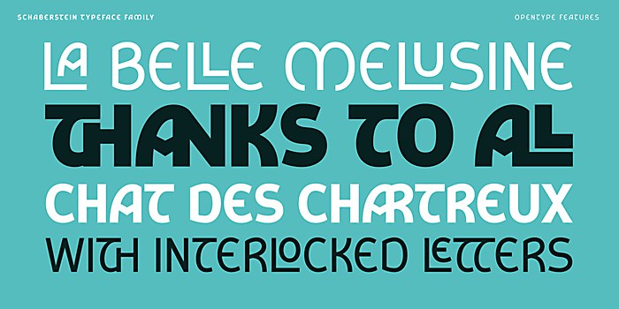
Favorite details: Overall, I am very happy with the project. I have a soft spot for certain letters like the lowercase a or g that blend functionality with a touch of personality. I am a big fan of the additional Opentype features, so I was very happy to be able to include a range of interlocking ligatures that can be employed to add a bit more flair to any text layout.
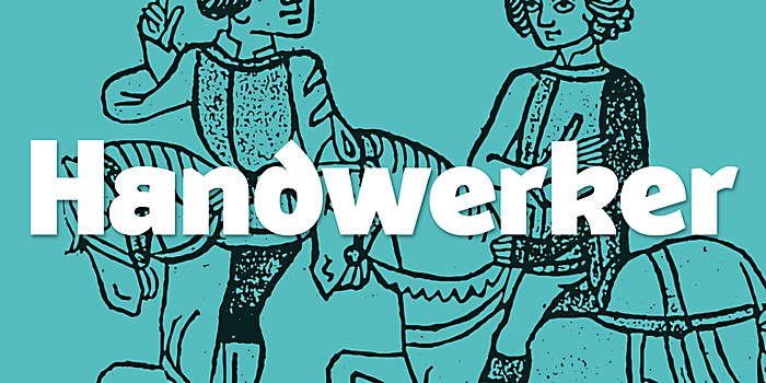
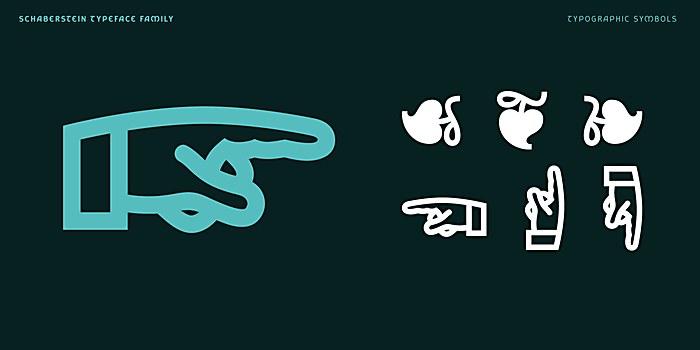
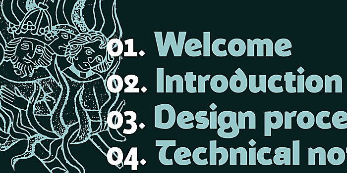
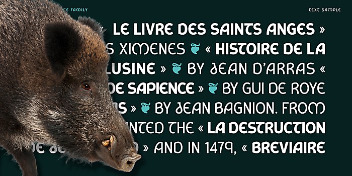
But I am particularly happy with two details, that may seem insignificant, but still bring a little smile when I think about them: First, I enjoy adding in certain special characters and symbols into my typefaces, from arrows to various typographic fleurons. Due to the historical roots, it only seemed fitting to create these glyphs for Steinschaber. I had spent quite a long time researching shapes and playing around with various treatments when it suddenly dawned on me that Steinschaber’s publication L’histoire de la belle Mélusine—also from 1478—featured a whole collection of illustrated figures, with many pointing fingers. I had found my inspiration! The Steinschaber typeface therefore includes a manicule that is very closely drawn from his illustrations. With Schaberstein, I again tried to modernize the shape while staying in the same overall spirit.
Secondly, a nice happy accident happened during the creation process. In keeping with the historical source, I had initially intended only to create the roman styles, since the slanted, italic style would only gain popularity some 30 years after Steinschaber’s work. But after the first tests, I felt that the lack of italic limited the applications and potential of the family and decided to add the corresponding variants. This change of heart had the unintended consequence of creating twelve styles in the family, the very same number of publications that Steinschaber created during his two years in Geneva.
New lessons: I view the project as a personal education, a path of discovery into a chapter of history that I knew very little about. Despite my interest and years of curiosity on the history of printing and typography, I knew nothing about Steinschaber’s work and his impact on Geneva. The research was a fascinating insight into the beginnings of print and how it spread throughout Europe. His own life—being born in Germany; traveling to Italy and probably working (or at least interacting with) the da Spira brothers, the famous printers; then his arrival in Geneva—showed how immigration and travel helped spread ideas and innovation across the world just as today.
While I have spent many years in type design, I also found the project a refreshing inspiration for myself. I got to embrace difference and originality in letterforms—even those destined for longer passages of text—that I hope other users will also appreciate and value.
Visual influences: The main visual influence was laid out in the letterforms that Steinschaber had employed, with their particular shapes and original solutions. The material seemed so rich that I felt that I had all the inspiration needed within his various publications. I quickly settled on the idea that I would not create a strict revival, but rather I would allow myself some creative freedom in interpreting his forms. This was born from a creative desire but equally due to the fact that his publications lacked a lot of glyphs that would be required of a modern typeface—for example, numerals, since they still employed roman numerals at the time.
Time constraints: I had the luxury of having no time constraints on this project since it was auto-initiated. The first design process happened around the end of 2019, with the project gradually evolving over the years and going through a series of iterations before I found my solution. A large part of the project was dedicated to undergoing research for Steinschaber and trying to understand the printer’s letterforms and their origins. Once I had completed that typeface, I then developed Schaberstein over the course of a year. Having these long periods of creative process was actually a great method, as it let me be engrossed in the work, then take a step back and return to the project with fresh eyes.
I could break down the process in three phases: First was the discovery process, learning about Steinschaber and the typeface with the initial aim of focusing on a revival idea. That sparked phase two, as it dawned on me that the letter shapes offered great potential outside the revival question, and that they could be developed into a new typeface family. And finally, the third phase was the further addition of the italic styles and the development of the complete Schaberstein typeface.
Specific project demands: Type design is all about constraints, and personally, that is one aspect I adore about the craft. Innovations may arise in the design tools or output formats, but the work remains very close to the challenges that the very first printer encountered. I view these design and technical constraints as a very freeing aspect. The solution is there before our eyes; it is just a matter of exploring the form and the rhythm of the letter sequences until one finds the best solution!
Alternate paths: I do have one remaining wish to fully complete the project and it would be to create some publication using letterpress printing. Since the source of the material was the printed page, it would feel very satisfying to be able to go full circle and introduce a digital typeface back into a hand-printed craft. I hope to be able to organize that soon!


