Responses by Hua Chen, senior designer, Team.
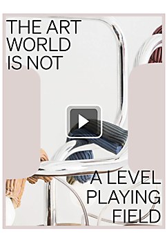
Background: Known for its “anti-fair” ethos and commitment to curatorial excellence, Independent was founded in 2010 as a distinctive voice in the monotonous art landscape. Its original art fair—a consciously-scaled, curatorial-focused exhibition at the former Dia Center for the Arts in New York—developed a strong reputation as the “insider’s favorite fair.” Fifteen years on, Independent has grown into a leading arts organization working to create a level playing field in an increasingly unequal art ecosystem. As the organization continued expanding its ambitions and offerings, it needed a new brand identity and strategic framework that fully reflected its evolution from a seasonal event to a vital support system for artists and the industry.
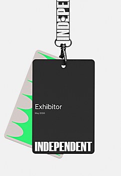
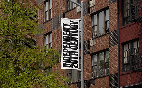
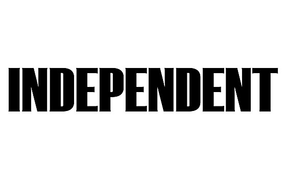
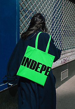
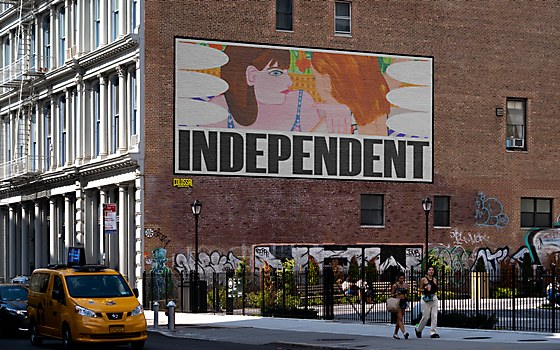
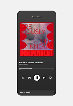
Design core: Ultimately, the new visual system and brand needed to grow and expand as Independent launched new ventures. While championing untold narratives in art is undoubtedly an international and intersectional endeavor, the organization’s perspective remains rooted in New York. Our solution acts almost as civic infrastructure does: a framework for new and different content that varies in flavor depending on the context of the communication, with ever-fluctuating image frames and a color palette that ranges from neutral to neon. Utilizing different “I Frames” and color combinations creates varied tonalities for different ventures while maintaining the same core structure and philosophy. The typography reflects the New York City point of view: Söhne, a sans-serif that captures the analog materiality of the “Standard Medium” used in Unimark’s legendary wayfinding system for the MTA New York City subway, serves as the primary font, complemented by a custom wordmark based on a modified version of F37 Foundry’s K9 typeface.
Challenges: Creating a system that could vary and speak at different volumes proved challenging given the diversity of ventures offered by Independent. On one end, the brand tonality needed to be very academic and reserved, especially when dealing with market-related and historical artworks. On the other end, it needed to be experimental and extrapolative to complement the nature of contemporary art and the narratives Independent seeks to champion.
Favorite details: It’s hard to pick one specific part of the project, but the subtleties of the modified wordmark tend to be tricky to nail and were incredibly fun to work on.
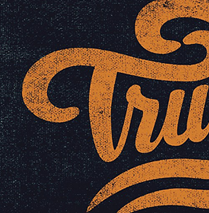
Visual influences: The bold, condensed quality of K9 recalls woodblock lettering and the type found on independent publications and underground rave flyers, reflecting Independent’s subversive philosophy. However, the increased contrast adds a level of refinement and elegance to the letterforms. Vestigial serifs inspired by the MTA’s existing enamel lettering provide another nod to New York.
Specific project demands: The 15th edition of the Independent fair occurred at the beginning of May in 2024, creating a heightened sense of urgency. However, Independent’s wealth of imagery from previous fairs made it far easier to envision what the brand could look like and to solidify actual deliverables quickly.


