Responses by Melissa Chavez, associate creative director, Wolff Olins.
Background: The New York Botanical Garden (NYBG) needed to be recognized not only for its beautiful garden in the Bronx, but also for the myriad of research, scientific achievements, policy influence and community outreach to which the institution has dedicated itself. Its previous look and feel only spoke to a fraction of its work, and different communities have recognized NYBG for different things.
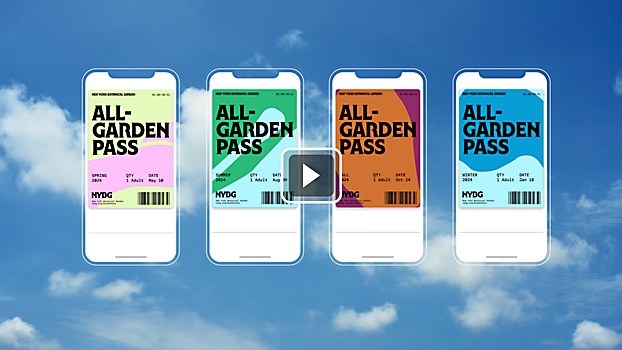
Design thinking: We didn’t want to abandon the legacy of this 132-year-old institution with the rebrand; we wanted to amplify what NYBG was already known for and unify its identity across communities. The new look and feel is equal parts inspired by the Garden’s history, the bold attitude of New York City and the Bronx, and the organic forms found in nature. We also expanded NYBG’s approach to color, graphics, photography and illustration to help the visual system feel as rich and lush as the experience of the garden itself.
Challenges: Making sure the right balance was represented in the wordmark. We wanted to create something that felt iconically New York, but we also wanted to acknowledge the history, expertise and authority that NYBG holds. We spent a lot of time carefully crafting the lettering to ensure the balance felt right.
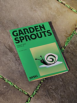
Favorite details: All of the elements in the design system are inspired by the garden! The colors come from the specimens found on-site, the illustrations are collected from community members, the graphics are colorful crops of the 250-acre grounds, the grid is inspired for the glass panes of the conservatory building and the dynamic text uses the conservatory dome to inform its dimensional quality.
Visual influences: The International Typeface Corporation (ITC) had a huge presence in New York for decades, and we wanted to nod to this within the typeface. We started playing with the ITC Serif by Herb Lubalin and Tony DiSpigna, crafting it to feel even more organic, plantlike and lush.


