Responses by Andrea Schenstrøm, digital designer, Bold Scandinavia.
Background: At architectural design firm Henning Larsen, it begins with curiosity—a core value of Henning Larsen that was vital to get across in the experience and throughout the entire project. It’s known for its innovative approach across architecture, landscape, urbanism and interior designs, encouraging an atmosphere of asking questions and providing new perspectives and creative life-centered solutions that confront the challenges of today and tomorrow. Henning Larsen approached us for a new website that would reflect its brand and values and wanted a digital platform for future partners, recruitment and sharing knowledge.
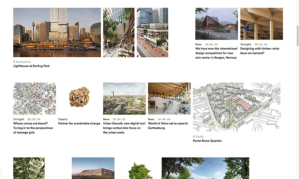
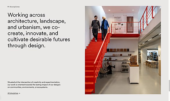
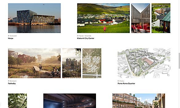
Design core: We wanted to capture the atmosphere of the creative and orderly messy world of Henning Larsen and how it works within modern and sustainable architecture. Our goal was to reflect its process, showcasing a mix of sketches, material prototypes, research and innovative software solutions up front—not hiding it in subsections or project pages. This is where the project and front-page grid were developed, which is essentially a playground of mixed media becoming a representation of the core curiosity.
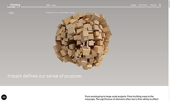
Inspired by Henning Larsen’s mission to create lasting change where both people and nature can thrive, we developed a set of 3-D key visuals. These serve as brand visuals and provide an abstract yet powerful representation of its commitment to sustainability in architecture.
Challenges: Balancing the vibrant, creative atmosphere of an innovative architectural studio with structured design systems and development. We had to seamlessly integrate a grid system with the dynamic, orderly mess of the studio while maintaining a high-quality user experience. This had its challenges not only in development, but also in creating the system behind it to be strong enough for different devices and viewports. We ended up with a result we think really works and speaks the visual language of the Henning Larsen atmosphere.
We had ongoing communication with Henning Larsen’s digital editor Camilla Løjborg Poulsen and director of communications Camilla Borggaard throughout the process. This made everything run smoothly, as they understood the design and knew exactly how to use it for future needs. Their involvement in decisions, from small features to bigger modules, ensured everything fit perfectly.
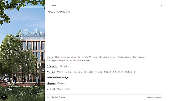
Navigation structure: The navigation embodies a mindset that, like Henning Larsen, is inherently curious. This is shown on the front page, where we made the decision to feature both highlighted projects, news and pages about the firm’s methodology together in an orderly messy grid. Displaying all types of content simultaneously while maintaining clear distinctions to guide the user to the appropriate information.
Henning Larsen’s curious mindset is also on display throughout the entire site. An example is the seamless navigation between the different projects by guiding the user to the next case project at the end of the current case project, encouraging the user to further explore.
Technology: The website was developed by DEPT. in Amsterdam, which used the headless CMS Kontent, Next.js and Framer Motion.


