Responses by Shrey Doshi, founder and creative director, Yellow.
Background: The purpose of Oriygen is to empower individuals to make better lifestyle choices through high-quality, scientifically backed nutraceutical products. Its initial product, an edible mouth spray, addresses specific health needs such as sleep, energy, immunity and bone health. Targeting a broad audience ranging from teenagers to older adults, Oriygen aims to be clinical and offers a well-designed, effective solution for health and wellness.
Design thinking: Our thinking behind Oriygen was to position the brand as both clinical and approachable. Given that the brand offers nutraceutical products, it was crucial to communicate the high clinical efficacy and scientific backing of the mouth sprays, while ensuring they looked accessible and user friendly. The tone of voice, product design and overall branding are all meticulously crafted to strike a fine balance between these two ideas, making Oriygen trustworthy and relatable.
Challenges: Designing a mouth spray that people would feel comfortable using in a post-COVID era, where the concept of spraying something directly into the mouth instead of the hands could be unsettling. Our challenge was to create a product that not only looked edible but also exuded clinical credibility. We needed to ensure that the design communicated safety, efficacy and trustworthiness, helping users feel confident in incorporating an oral spray into their daily health routine.
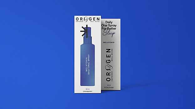
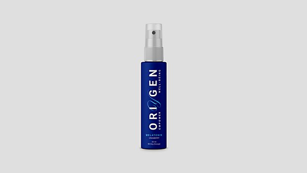
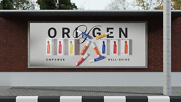
Favorite details: We’re quite proud of the design and communication of the packaging. Its architecture is industrial yet refined, with clean sans-serif fonts, precise graphics and a direct tone of voice. The design communicates clearly and effectively, featuring elements like a silhouette of the bottle on the box that indicates its use, and straightforward nomenclatures that tell the user exactly what the product is and how to use it. We paid close attention to the finer details, such as the fine grain texture on the bottle drawing that subtly refers to the idea of it being a spray along with a gentle embossing. The specific shade of white with the subtle texture provides a tactile experience. The box and bottle not only feel sturdy and well-crafted, but they also convey the product’s functionality with clarity and sophistication
through thoughtful textures, colors and communication.
New lessons: Given the unique positioning of the product among its competitors, we learned several things throughout the process. One key insight was the importance of the bottle’s use case: no matter how well-designed or aesthetically pleasing the bottle is, its use case is crucial. When we handed the bottle to people, they often thought it was something other than an edible product. Testing the product without any context helped us assess the effectiveness of the packaging’s colors, texture and communication. This experience underscored the significance of clear and effective design elements in conveying the product’s purpose.
Specific project demands: The clients were very collaborative and open to exploring new ideas for the brand’s visual communication, which made it easy to experiment with various styles of graphic design. However, the challenging part was creating a bottle that struck the right balance between looking edible and clinical. Every time we handed the product to someone, they thought it was a hand sanitizer or a face mist. This is where the combination of a white clinical box and a colorful bottle came into play. Beyond verbal communication, we added an illustration on the bottle showing a person spraying it directly into their mouth, serving as an additional touchpoint to clarify its use case. Overcoming this communication barrier was indeed the hardest part of the project.


